technology@apmpnca.org
Facebook
Linkedin
Youtube
Search
Search
Home
About Us
Board of Directors
Committees
APMP-NCA Bylaws
Affiliate with APMP-NCA
Connect with APMP-NCA
Contact Us
Resources
Pens Down Blog
Contribute an Article
APMP International Resources
Jobs Board
Corporate Partners
Events
Conferences
Webinar
Professional Development
Graduate Pathway Program (New)
Mentor – Protégé Program
Blog - Home
Insights & Updates
April 30, 2026
Ode to My Franklin Planner
Read More
March 31, 2026
You’ll Be Fine
Read More
October 27, 2025
Where are You on Your Priority List?
Read More
May 28, 2025
Surviving (and Secretly Winning) Networking Events as a Neurodivergent Individual
Read More
May 22, 2025
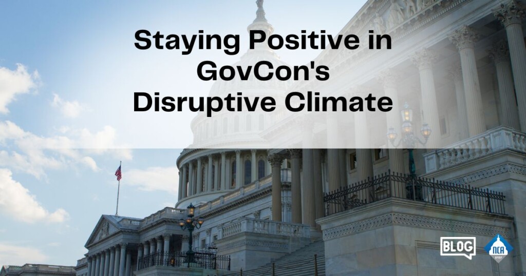
Staying Positive in GovCon’s Disruptive Climate
Read More
April 29, 2025
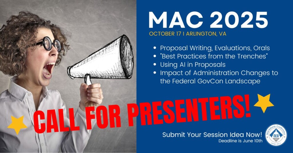
MAC 2025 Call for Speakers Now Open!
Read More
April 11, 2025
Spring Forward: Recognizing Your Own Career Growth and Owning Your Value
Read More
March 30, 2025
Volunteer for the MAC 2025 Conference & Expo
Read More
March 21, 2025
March is Women’s History Month: Who Has Influenced You?
Read More
Load More